
How to use Procore data to build a real-time project dashboard
Learn more about using Toric to build a live project dashboard in our on-demand webinar.
What is a live project dashboard?
Before we jump into the tutorial, we want to first give you a look at the real-time project dashboard that we are going to build. This real-time project dashboard combines data from multiple Procore tools or endpoints and provides a holistic view of a project's health in near real-time.
Procore has APIs endpoints that Toric hooks into to extract data from that includes various metrics for vendors, submittals, change orders and RFIs among many other things. In this article, we will be referring to these as endpoints because that's where the data is being extracted.
Now, let’s get into the tutorial.
Set up the Procore and Toric Connector
Toric is a data analytics workspace. We are the fastest way to turn data into insights. We hook into all of your data sources for analytics. This gives you real-time dashboards and reports, and allows you to manage your data pipeline, all in one place, without writing any code.
Procore is a Project Management software for users to manage their projects, resources, and financials from project planning to closeout. The platform connects every project contributor with the owner and general or specialty contractor.
With Toric, you get 50+ out-of-the box data connectors that allow you to extract all your data sources from operational and business systems like Procore, Autodesk, SAP, Oracle, Sage and combine with many others data sources, such as financial data, scheduling data, design (VDC/BIM) data, safety data, estimating data, bidding data, field data, etc.
For this example, we will be using Procore as a data source, in which Toric offers access to over 90 endpoints - like budget, RFIs, Submittals, and Vendors - to derive insights from as unified metrics in real-time dashboards and reports as interactive visuals, and combine with multiple other data sources, or to share them bidirectionally, giving you a 360 view and control of your projects and your business.
For any of Toric’s data connectors, you typically only need your user credentials, but for Procore, there is one more step.
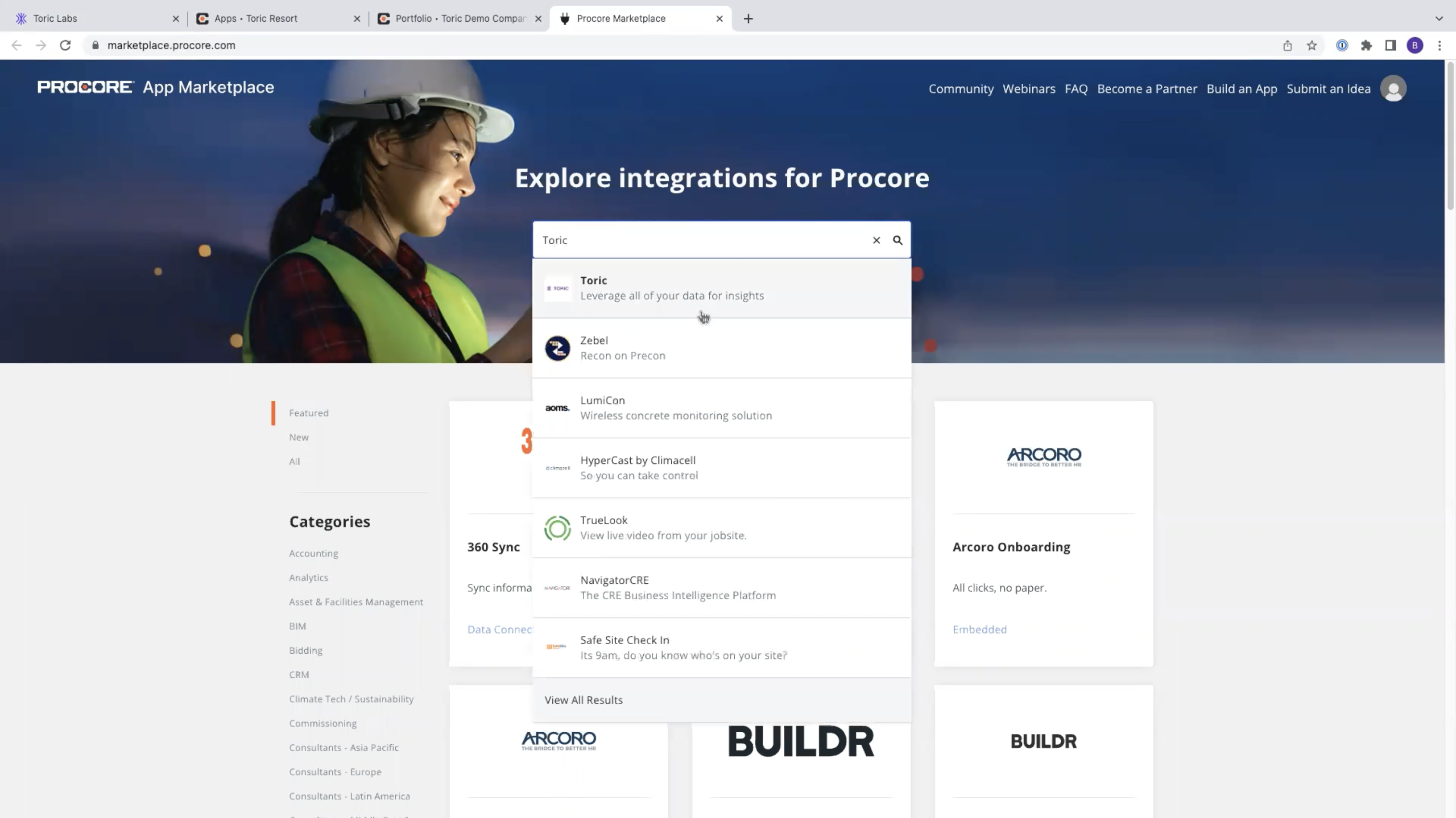
Before setting up the configuration in Toric, navigate to your Procore instance and in the upper right hand side under Apps. Click on the Marketplace button and on the new screen, type in Toric. On the Toric integration landing page, click the Install App button. Once the Toric app is installed on Procore, creating the connection in Toric will take less than a minute.
Now we need to configure the Procore integration within Toric. Navigate to the menu on the left and select Integrations near the bottom. You should see a grid of integration options. Find Procore and select Setup integration.

You will be redirected to the Procore integration page. Under Connector click Create a Connection. Give your configuration a simple name and choose your API endpoint.
The development endpoint is gonna be api.procore.com. Once your endpoint is selected, click Login with Procore and sign in with your credentials. You will then see a second prompt to give Toric access to Procore and select Yes. When finished, select Validate your configuration. Once validated, select Add configuration.
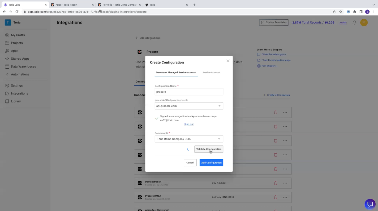
This is the configuration that we are going to use to set up the automations.
Configure the automation
Now we’re going to set up the automations, which is the part of this process that makes our dashboard real-time. First, let’s define automation in Toric:
Data automation in Toric is the process of extracting data from a source, transforming it or loading data into a targeted system (warehouse / data lake) using automated tools instead of manually performing these tasks.
Automations in Toric can be manual, scheduled on a time basis, or web hook driven. When creating an automation, it’s important to answer the question, how do I want to ingest my data?
Web hooks will trigger automations when your source is updated, so Toric will ingest data only when it has changed. For this example, we want this on a time interval set to every five hours.
In the left hand menu, navigate to Automations. Click Create an Automation button. Give your automation a friendly name, description, and set the Trigger to be time-based on a five hour interval.

Now we need to define the action that will be executed when this automation is triggered. Set the Action type to Import Data. Under Application, select Procore and under Configuration, select the Procore configuration we created at the beginning of this tutorial. Select the destination project where you want this data to land.

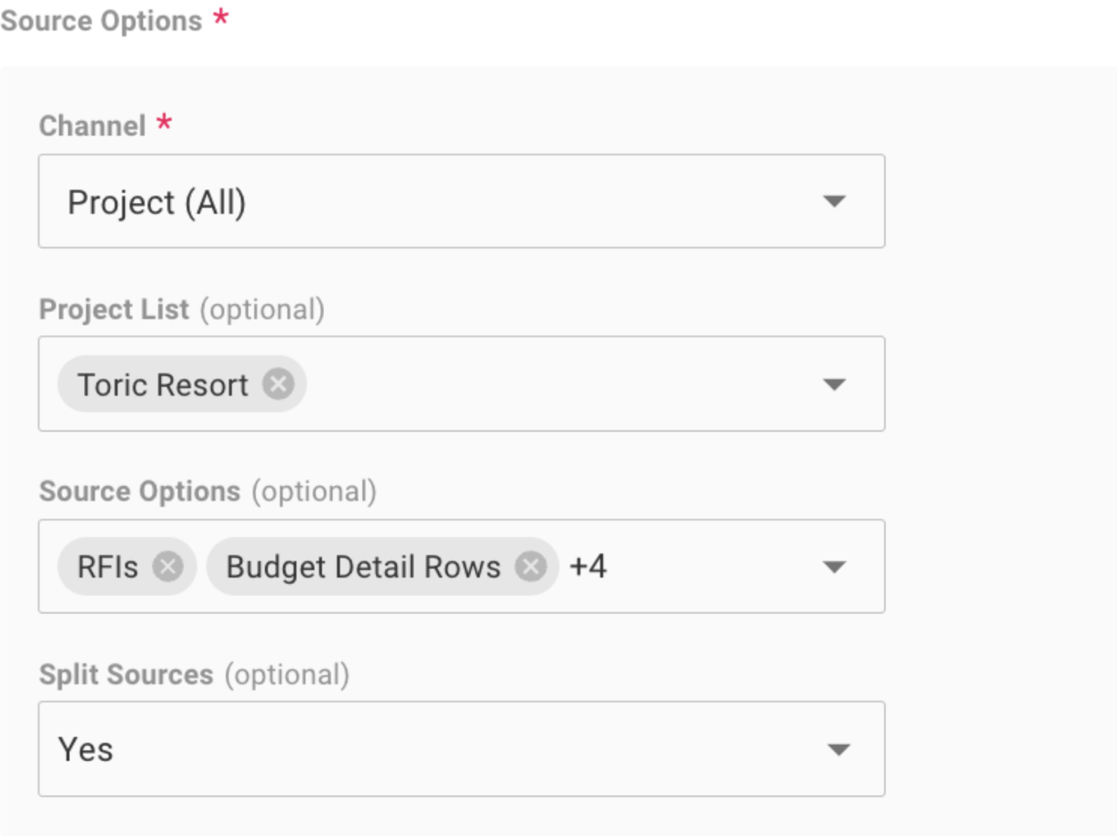
Now, let’s configure the Source Options. Source Options determine the actual Procore data we want to use. For the sake of this example, we’ve chosen Project Toric Resort. Select the different endpoints you would like to use in your dashboard. Here we have selected six different endpoints in this automation - RFIs, Budget Submittals, Vendors, Manpower Logs, and Manul Forecast Line Items.
That is the last step to enable this automation to run, irrespective of whether or not you're logged into Procore. Once the automation is set up, you can see how often this automation has run, the time it took to ingest that data, and whether it was a success or a failure within the automation history.
Now, let's head over to the project where we've asked that data to land.
Create your dataflow
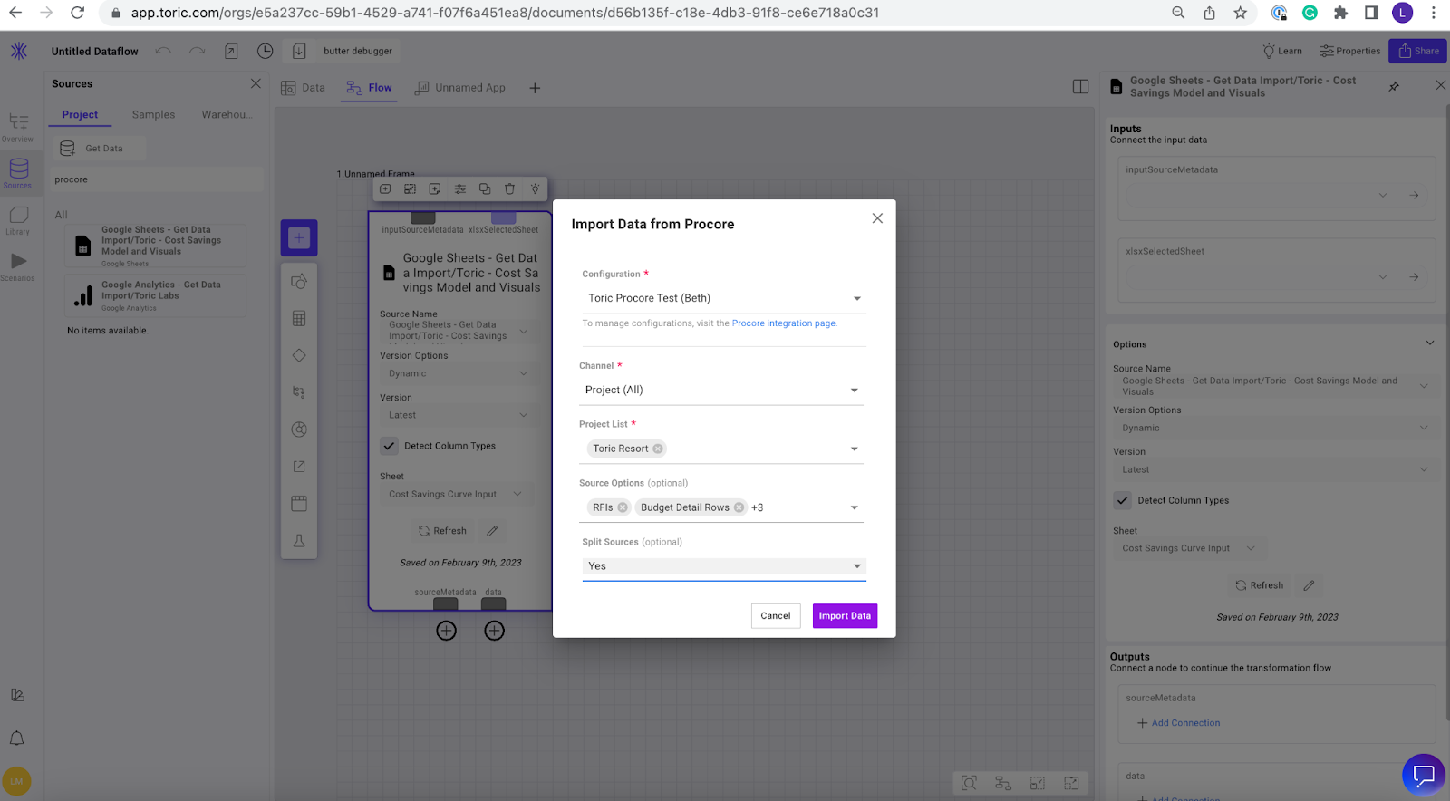
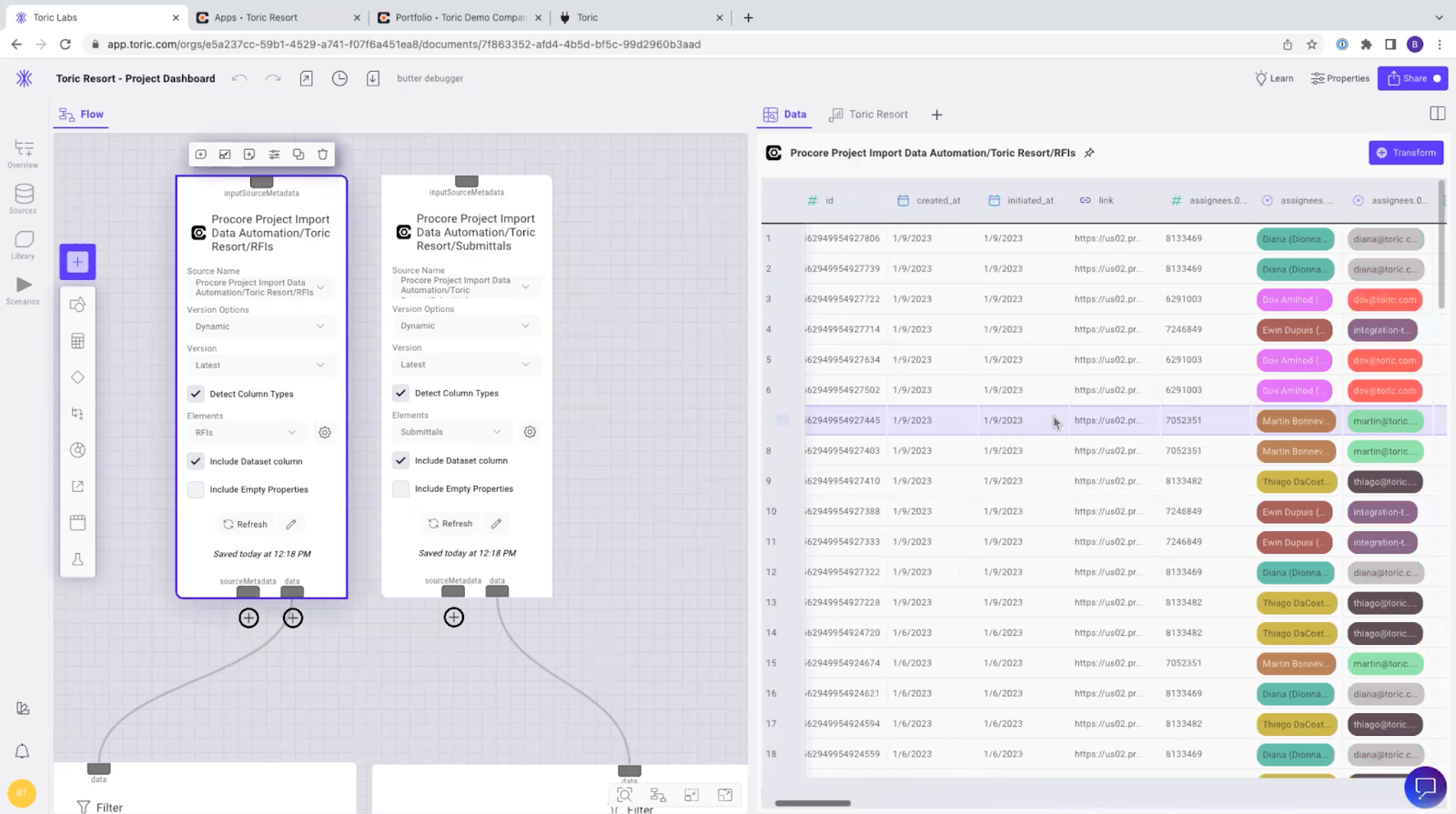
Open the Project you created in the beginning of the tutorial and select Create dataflow. On the left-hand menu, navigate to Sources and then click Get Data. Here you will select the Procore configuration we set up earlier in the tutorial. You will want this configuration to match the source options we selected in the automation.
Now these are the sources being used in my data flow. The next important question to answer is, what do we do with the data after it's ingested?
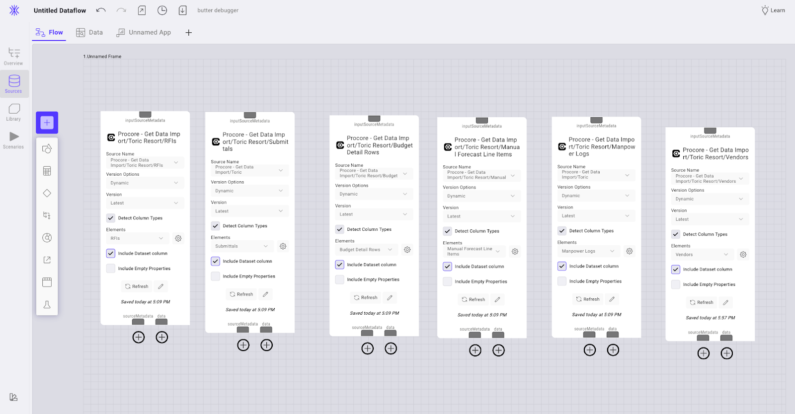
Open the data flow and you will see three tabs here at the top - Unnamed app (this will be your dashboard), Data Inspector, and Data flow. Click on Data Flow. These six endpoints we chose in our automation are now represented in the Data Flow as Source Nodes. These nodes will feed the data to our dashboard.

Let’s start to build the data flow. Drag your source nodes into the data flow canvas. For the sake of this example, we want all the endpoints used in our automation: RFIs, Budget Submittals, Vendors, Manpower Logs, and Manul Forecast Line Items.
You’ll see that Detect column types is checked on the source node. Data lands in Toric in its rawest format, and this ensures Toric automatically makes an inference of data type and determines if the format is date, time, currency, etc.
In the RFI source node, under Elements select RFIs and check the box Include Data column. Repeat this process for all of your source nodes selecting the endpoint relevant to each source node.
In this workspace, you can view the data inspector at the same time and see exactly how that data came into Toric using the split screen function. While transforming, you can use the data inspector split screen to see what is actually happening to your data set.
Start your transformation
Nodes are the actions chosen to clean up your data. Our full dataflow for the project dashboard embedded to this article looks like this:
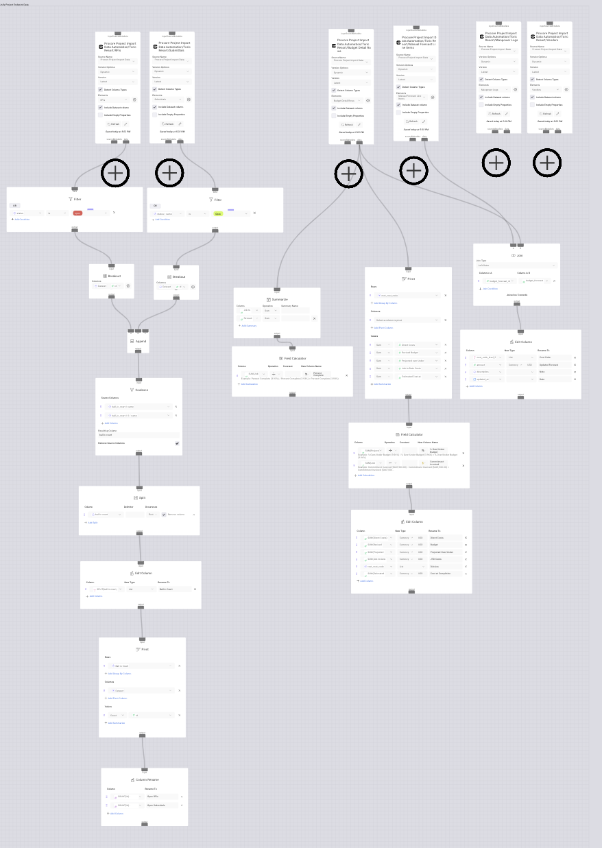
As you follow this tutorial, you may have your own unique transformation needs based on the dashboard you are creating.
For the sake of this example, I will walk you through transforming RFIs and Submittals so the end product is a clean table of open RFIs, Submittals, and who they are assigned to.
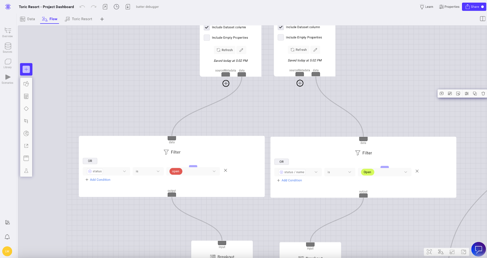
We need to start by adding a Filter node to both RFI and Submittal source nodes. Click on the plus icon under data on the RFI source node and type or scroll to find Filter. Set this node to filter by Status is Open. Repeat this process for submittals.
Next we will add a Breakout node to break them out by only the fields we want to represent in the dashboard. Under the RFI filter node add a new Breakout node. For the sake of our example, the RFI fields I want to represent are Dataset, ID, Created at, Ball in court Name, and Number.
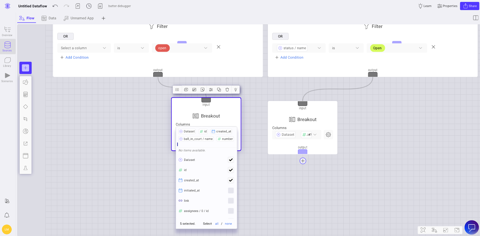
Repeat this process for submittals selecting the columns you want to represent in the dashboard.
Now we need to add an Append node to the RFIs breakout column and connect it to the Submittals Breakout node.
After the Append node, add a Coalesce node. This allows us to combine columns of the same type containing a single value across them. In my example, I want Ball in court name for both RFI and Submittals to result in ball in court.

Now we want to add a Split node and select the column name we just created in the Coalesce node, ball in court. Set the Occurrence to first and check the Remove column box.
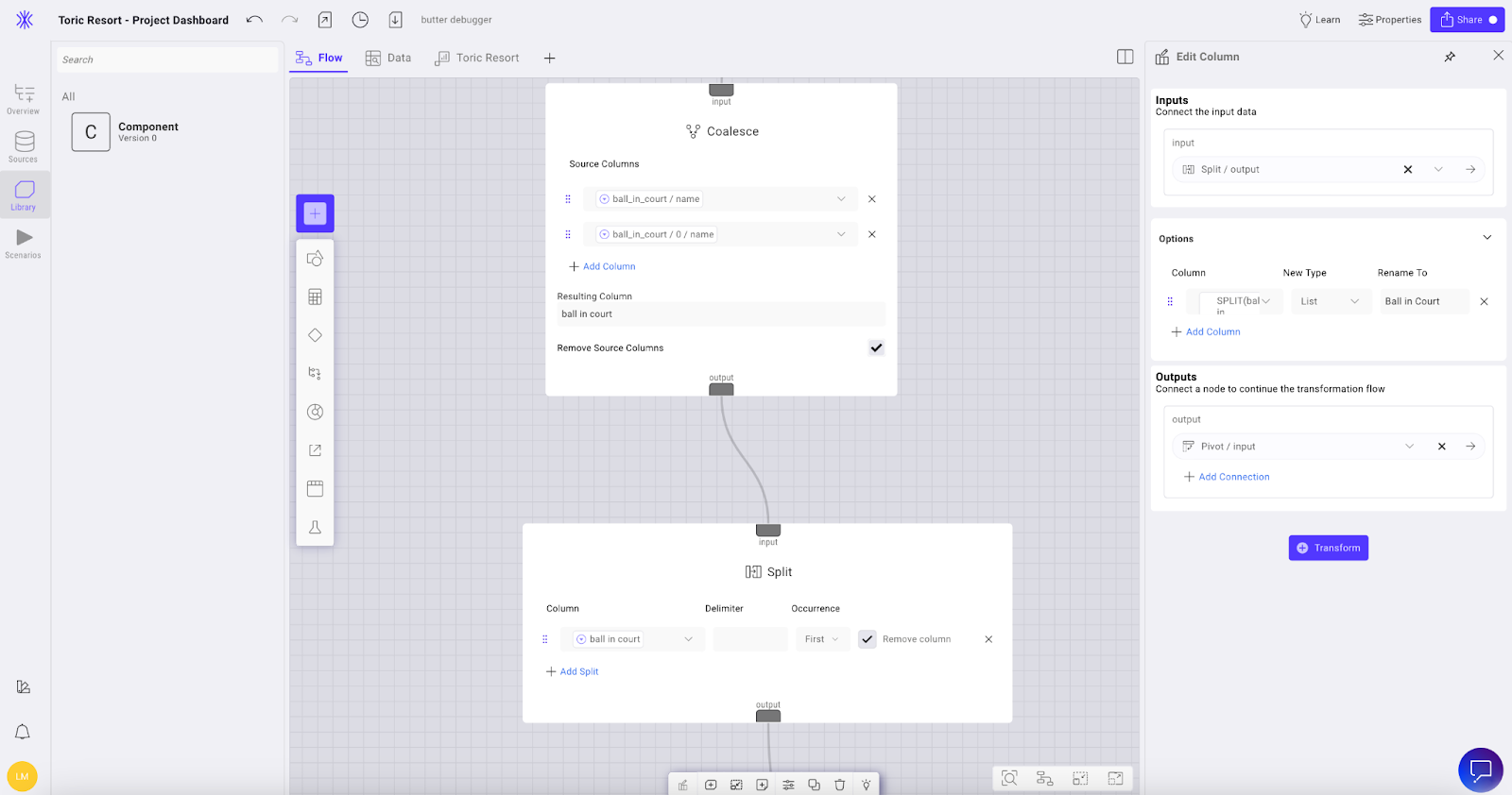
Now we need to add an Edit column node and rename the column to Ball in court.
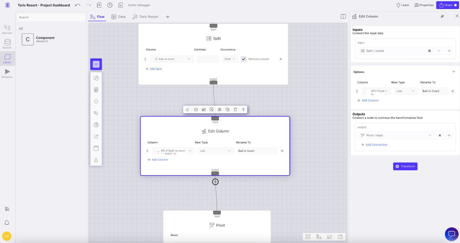
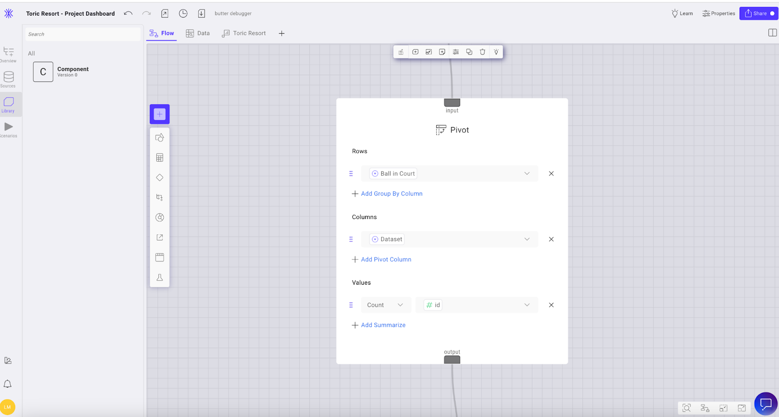
Now we’re going to add a Pivot node. Set the Rows to Ball in Court, set the Column to Data set, and set the Values to Count by ID.
Lastly, add a Column rename node. This will be the source used to bring the values of our open RFIs and Submittals to visualize in a stacking bar graph.
Create your visualization
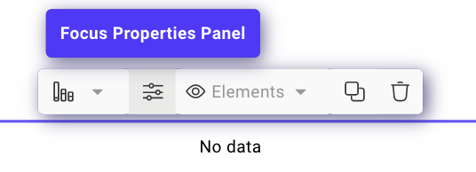
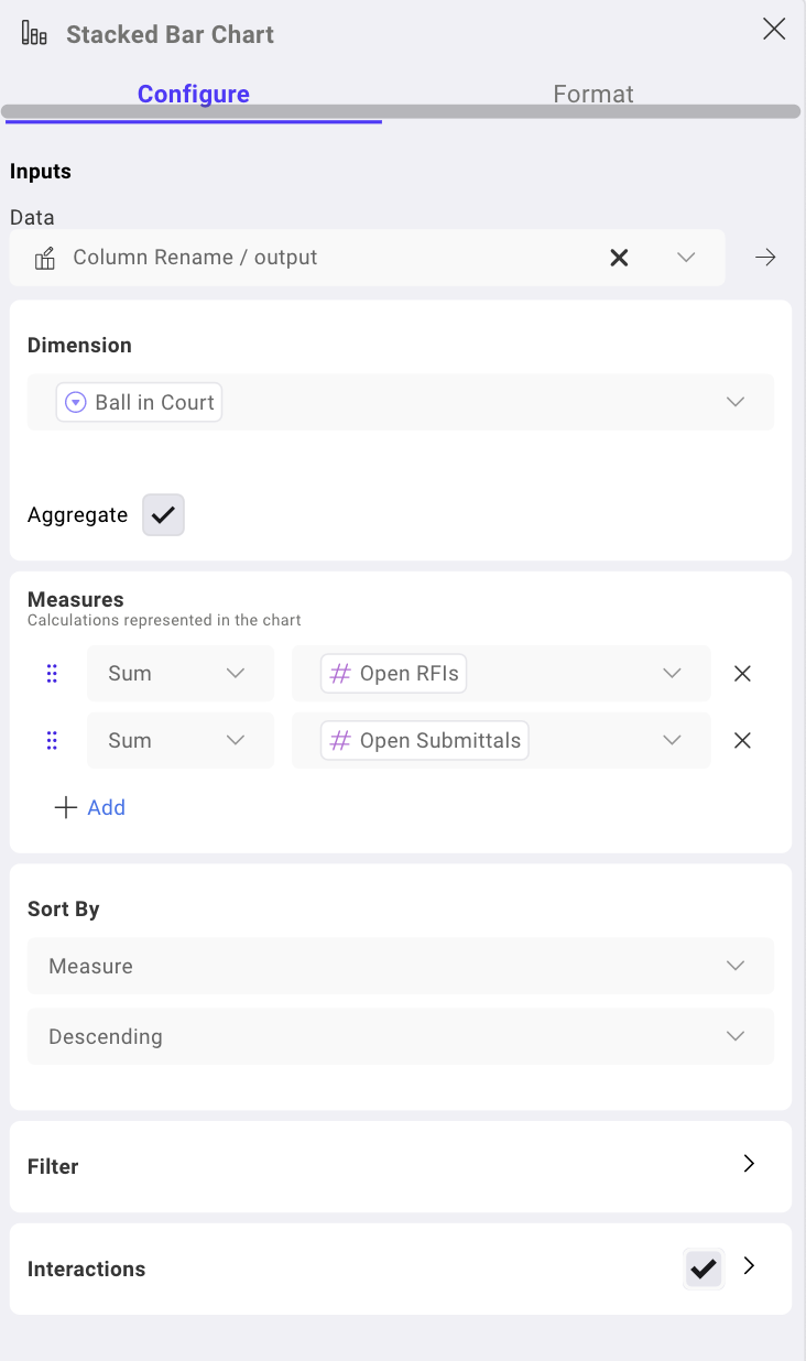
To start creating your visualization, click on the Apps tab in the top left menu bar next to Flow. Click the Add button in the top right corner - for this example, I want to use a Stacked bar graphic. Click onto the Focus properties panel button to configure your visualization.
In this panel, you can format and configure your stacked bar graphic. For my example, my configuration measures the bar charts by the Sum of Open RFIs and Open Submittals and groups them by individual.
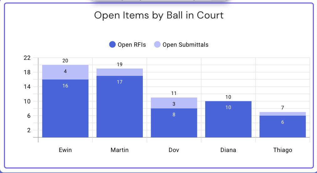
After completing formatting, here is how my bar graph displays:
Sharing your transformation
Now you have gone through building your dataflow and visualizations and you’re ready to share the dashboard. There are a few ways to do this.
In the upper right corner of the workspace you will see a Share button. THis allows access to the dashboard a number of ways.
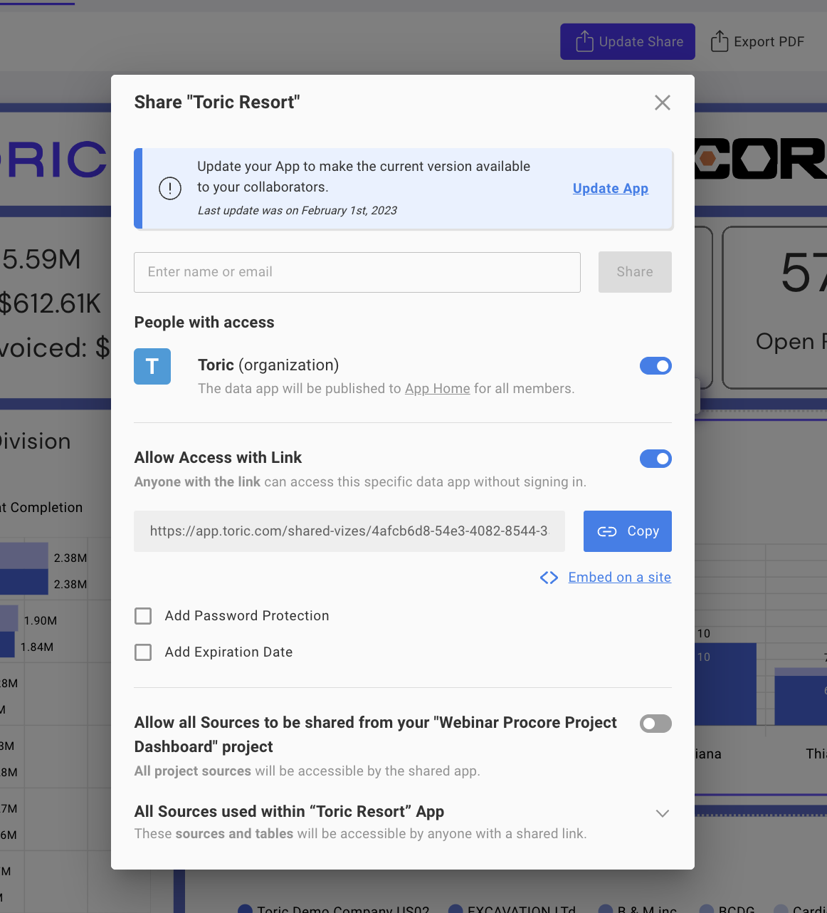
You can share with a person's email directly, give access to all users within your Toric Organization, or allow access via a link that can be password protected or set for expiration.
There is also an option to copy an embed code to share this dashboard directly within Procore, or within a website. With the embed function, your dashboard will maintain all of its basic functionality and interactivity.
Conclusion
Thanks for reading our walkthrough on how to build a real-time project dashboard using Procore data and Toric. To learn more about using Toric to build a live project dashboard from a Sr. Data Management Analyst at Cadence McShane, Chris Ortiz, and a Procore Certified: Project Manager, watch on-demand webinar.
If you’d like to see a tailored demonstration - request a demo, and if you’d like to get started on your own - try Toric free, create an account and get one million rows of data (credits) for free.
.png)


.png)


