Data Visualization
Types of Visualization
In this section you will have a high level understanding of:
- Types of visualization supported by Toric
Types of Visualization
Text
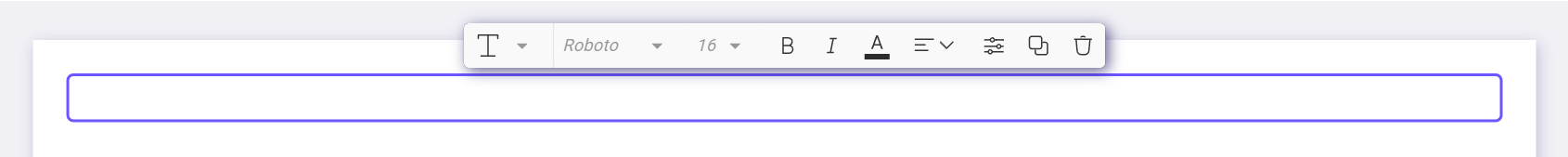
In Toric, text boxes can either be filled with manual text input or set up with dynamic connections to aspects of the data flow. Additionally, text boxes can be converted to headings. Format control features for text boxes are available through the tool tip bar and/or the Properties panel. For more information, refer to Working with Visualizations..
Charts
Toric Visualizations support several standard chart visualization elements. All visualization elements can be configured using the Properties panel. For more information, refer to the Working with Visualizations section.
Below are some commonly used chart examples:
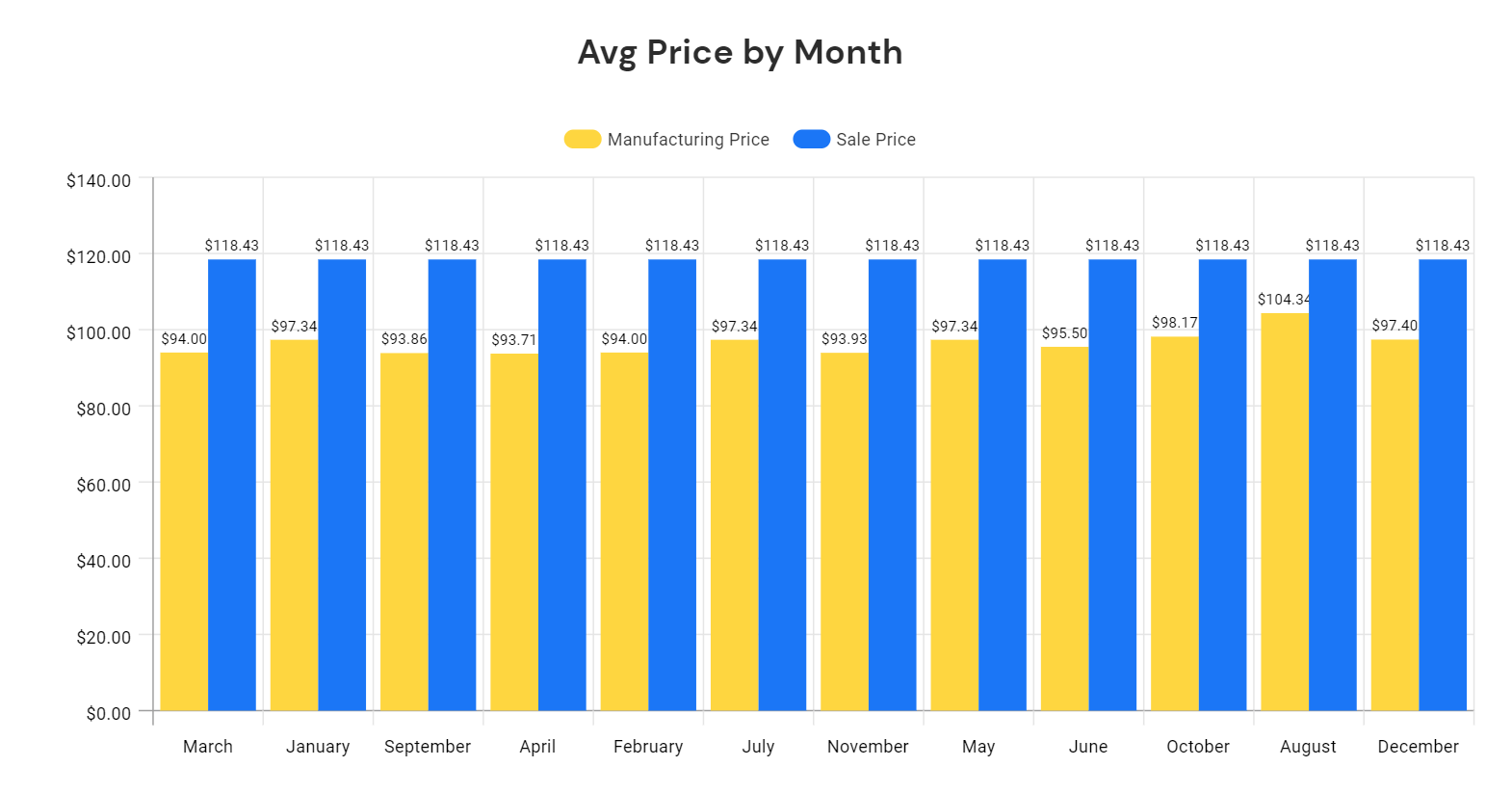
Bar Chart Example
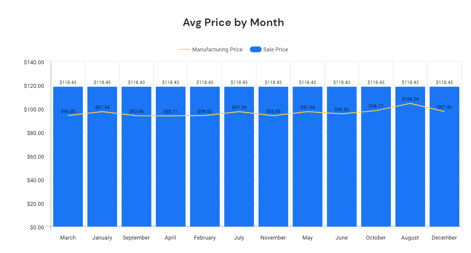
Combo Chart Example
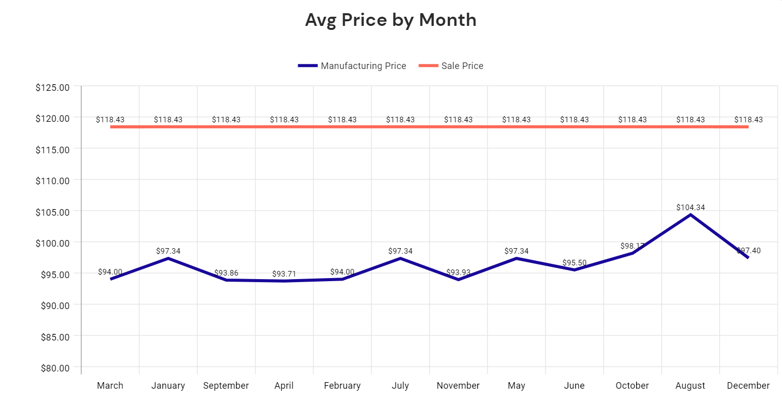
Line Chart Example
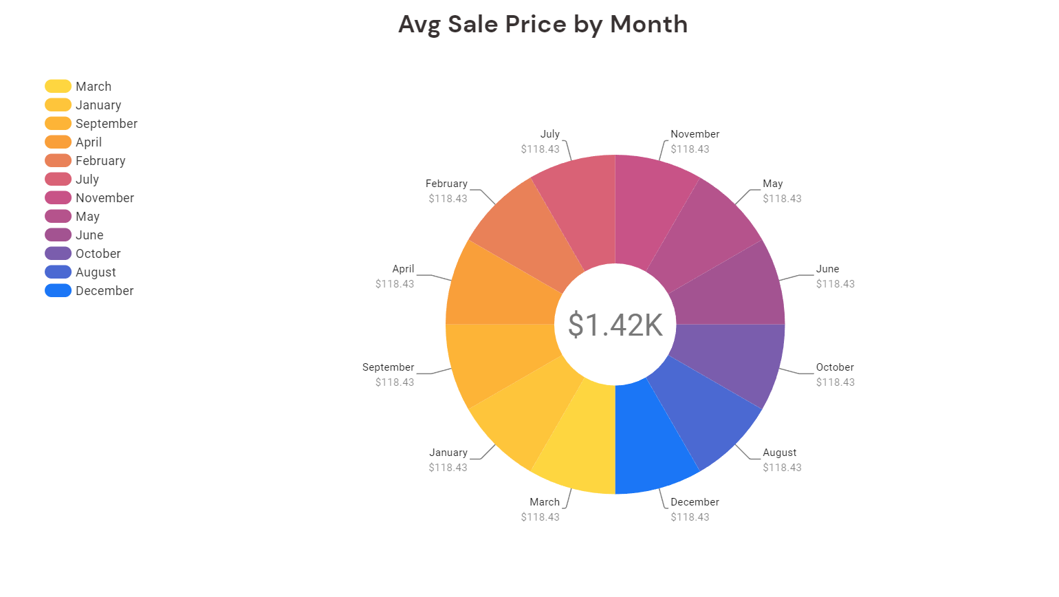
Pie Chart Example
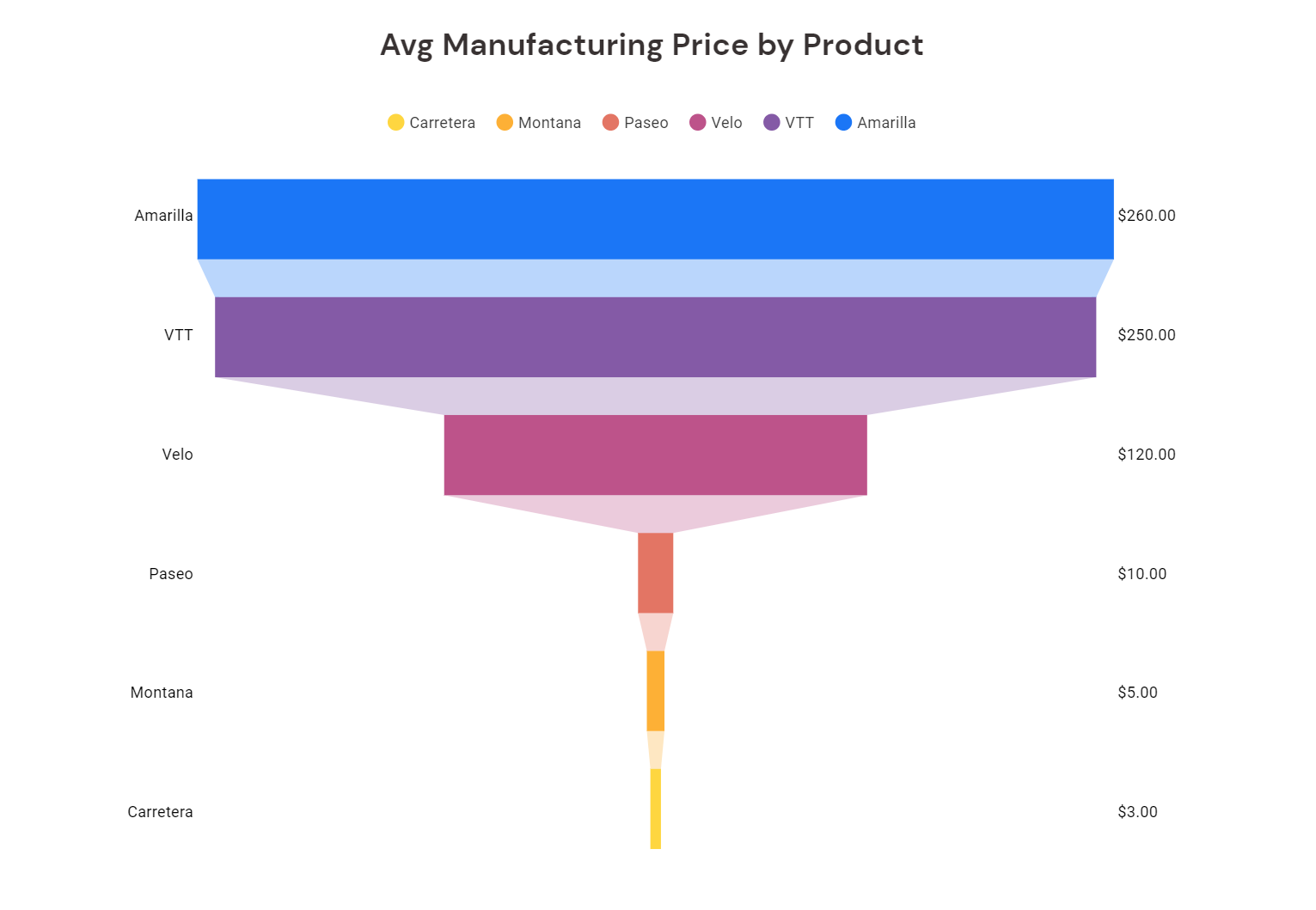
Funnel Chart Example
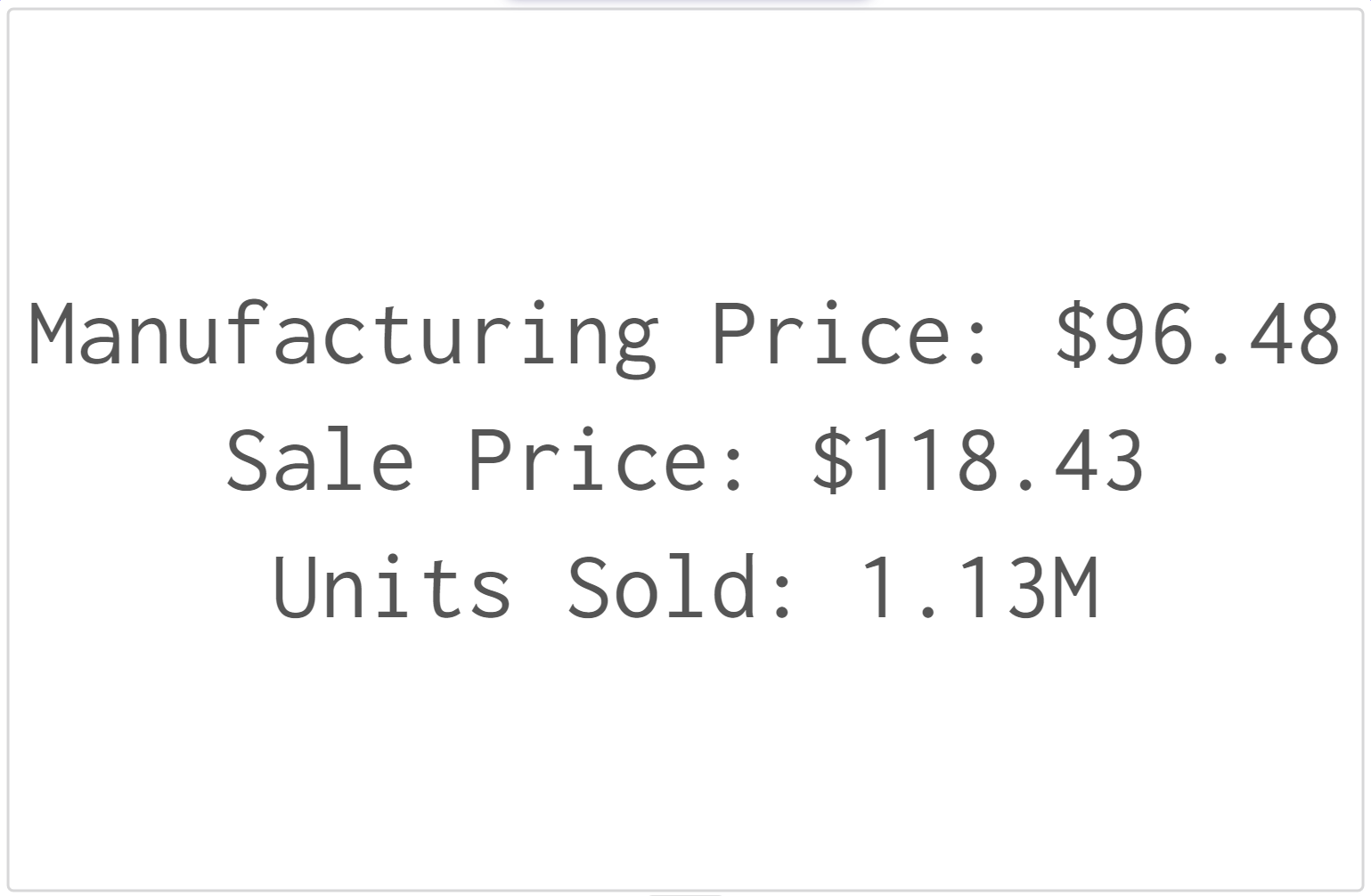
Scorecard
In the Data App, you can use a scorecard as an alternative form of visualization. To add and configure a scorecard, follow the same steps as for other visualizations. However, scorecards have the unique feature of not having a dimension, and only aggregate over different measures. Refer to Working with Visualizations for more information.
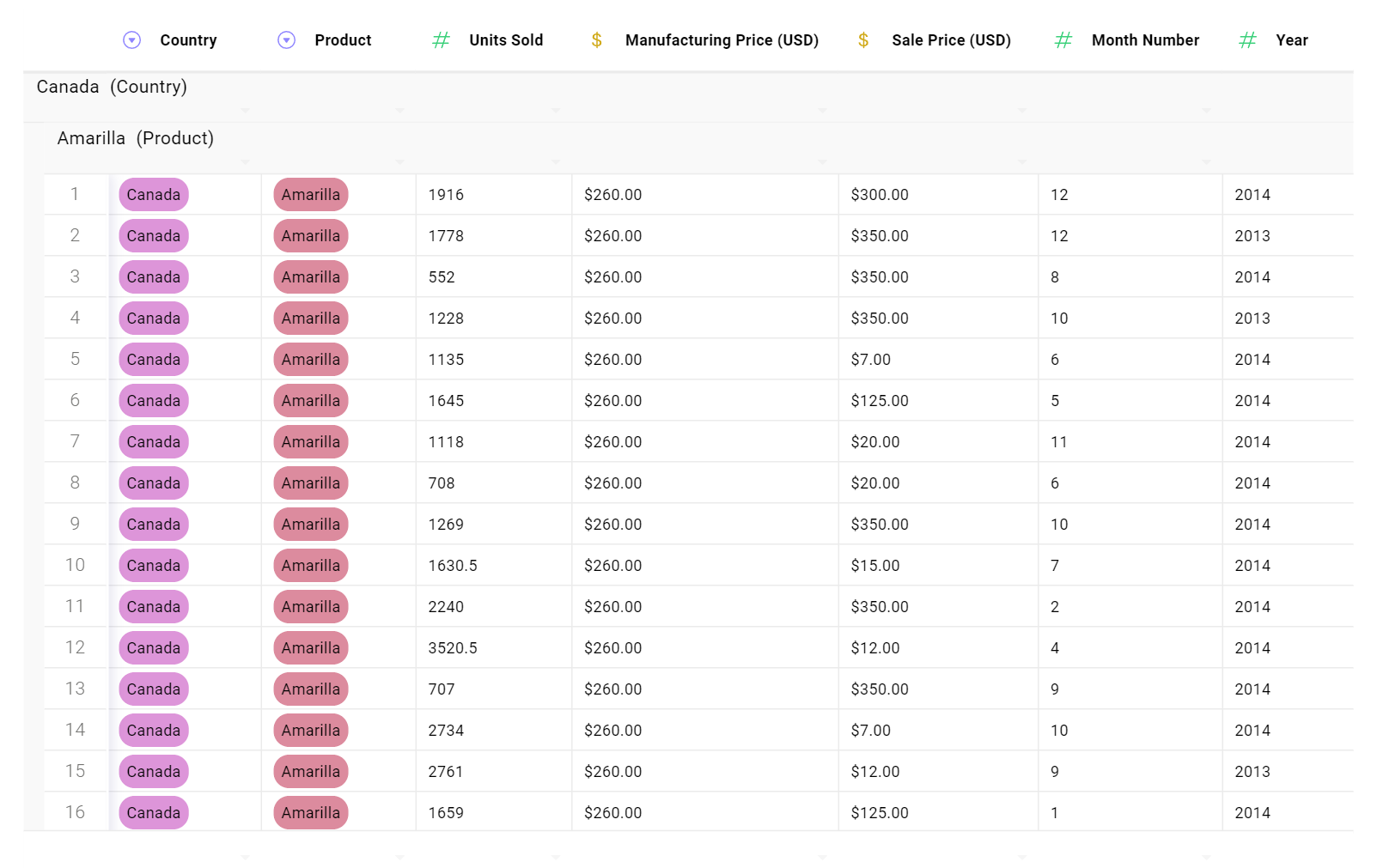
Tables
Toric visualizations enable users to create tables from data flows. Tables can be configured using the properties panel. See "Working with Visualizations" for more details.
Model Viewer
Toric Visualizations allow users to create a model view from the data flow. The model viewer can be configured using the properties panel. See Working with Visualizations for more details..
Working with Visualizations
This training session will cover the following topics:
- Adding visualizations in Data Visualization
- Configuring and formatting visualizations
- Organizing visualizations in Data Visualization
Adding Visualizations
Visualization can be added to the Data Visualization using the following methods.
Add
The Add button, located on the right-hand side, allows the user to add a new visualization holder. You can connect your data to the holder by either dragging and dropping the flow or configuring the visualization input. Once you have connected your data, you will have successfully added a visualization.
However, visualizations created in this way are not fully configured. To configure them, you will need to use properties. We will explore visualization configuration in more detail in the Visualization Configuration sessions.
Connecting data through drag and drop.
Connecting data by configuring visualization input.
Drag and Drop
Another convenient way to set up a new visualization is by using the drag and drop feature. You will have both the Overview panel and the Data App opened. To create a new Data Visualization element, simply drag a flow from the Overview panel to an empty space in the Data App.
This method can also be used to overwrite an existing Visualization Element in the Data App.
Make a copy
If you have already created one or more visualizations, you can make a copy of the existing one(s), and modify the data input and/or configuration to create a new visualization.
In the example below, we made a copy of an existing Bar Chart, switched it to a Combo Chart, and changed the configuration.
Configure and Format Visualizations
Configuration controls which data will be presented in the chart. Formatting determines the data visualization's appearance, including font, color, and styling. Both the Configuration and Formatting panels can be accessed through the Properties menu. The Tool Tip Bar also has the properties button and common formatting built-in for quick access.
Visualization Configurations
All configurations for a visualization can be controlled through the Properties menu. Although different visualization types may have different configuration settings, there are similarities among them.
Chart Configurations
In general, there are several sections for configurations, including inputs, dimensions, measures, sort by, filter, and interactions.
In the example below, we demonstrate how to modify the input data.
The following example demonstrates how to change dimensions and measures.
In this case, the dimension is the column used to define the different bars of the bar chart. The dimension can be changed to any available columns from the input data. Similarly, the measure must be selected with the ability to choose the method of aggregation.
In the example below, we showed how to use "Sort By".
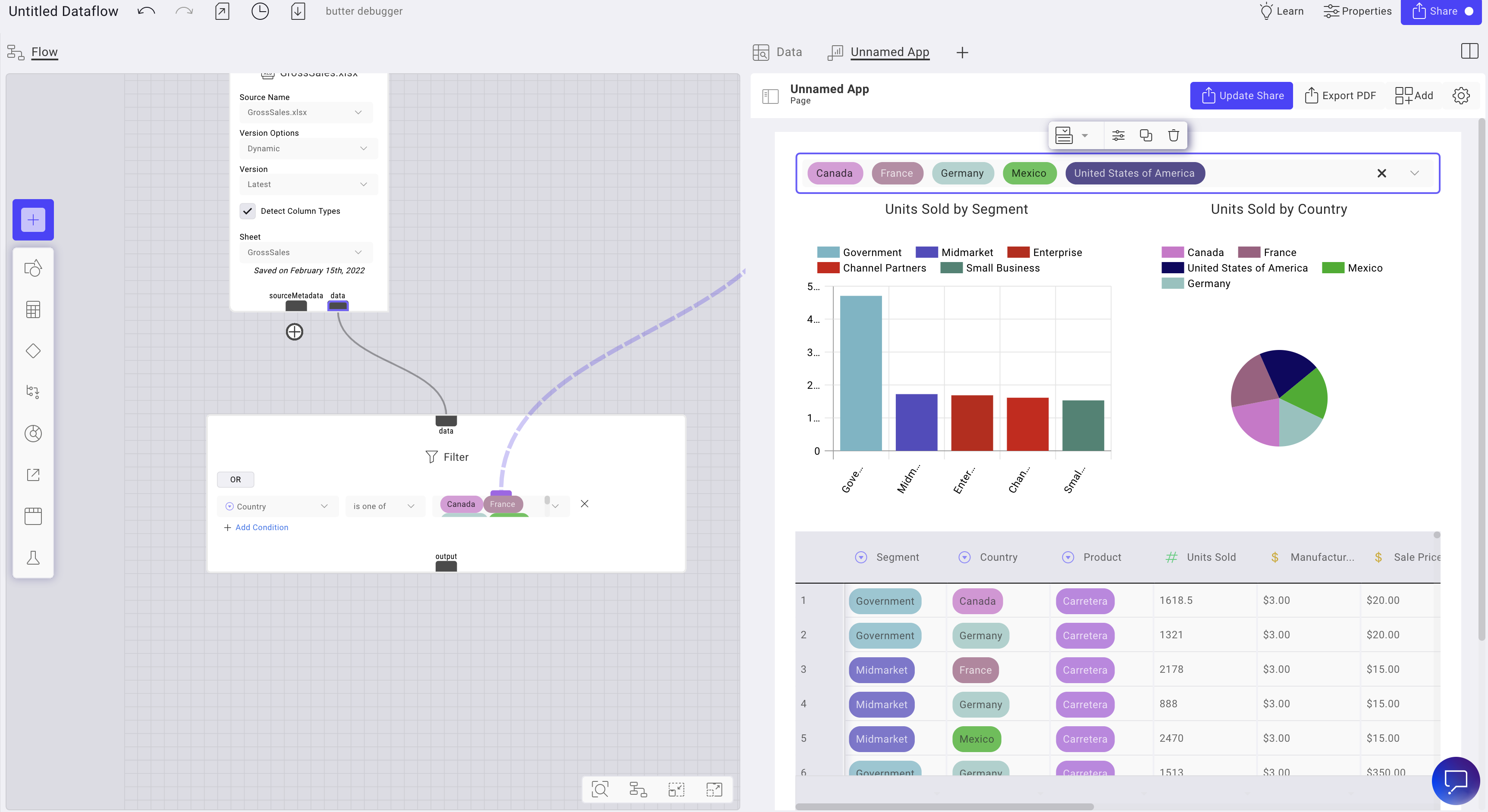
In the example below, we demonstrated how to add a filter.
In the example below, we briefly demonstrate how charts can interact with each other. For more details, please refer to Interactivity → Chart Interactions.
Table Configurations
In the example below, we show all the options for configuring a table.
Visualization Formatting
All formatting options for a visualization, such as chart title, data styling, legends, and background & border, can be controlled via the Properties menu. Some options are available through the Tool Tip bar.
Chart Title
The Chart Title option allows you to adjust the chart's title and font. In the example below, we demonstrate how to adjust the chart title.
Data Styling
Data styling allows you to control the appearance of your chart. In the example below, we demonstrate how to adjust data styling for a bar chart.
In the example below, we demonstrate how to adjust data styling for a Combo Chart.
In the example below, we demonstrate how to adjust data styling for a pie/donut chart.
Legend
In the example below, we demonstrate how to adjust the legend.
Value Labels
In the example below, we demonstrate how to adjust value labels.
In addition to the adjustments shown above, you can set the positioning of value labels, their colors, vertical/horizontal and more options as shown below.
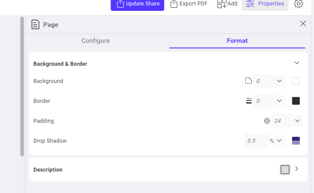
Background and Border
The following example demonstrates how to adjust the background and border.
(Note: the border sides option bug needs to be fixed.)
The following example demonstrates how to adjust the description.
Page Formatting
Toric also supports changing formatting on the page itself. See the screenshot below for available options.
The following example demonstrates how to format a document or page.
Table Formatting
Toric supports the positioning table feature. There are three alignments available in Toric:
- left
- center
- right.
Follow the step-by-step instructions below and watch the video to learn how to align your tables:
- Click on the table that you want to align.
- Click on "Properties" located on the top right side of the screen.
- Make sure you are in the "Format" tab.
- Select the desired alignment under the "Alignment" section.
The following example demonstrates how to change table positions:
Organizing Visualizations
Drag and Drop
The easiest way to organize visualizations is by using drag and drop. When you drag a visualization, a light blue line will appear to indicate where it will be placed.
In the example below, we demonstrate how to reorder visualizations using drag and drop.
Container
Another way to organize visualizations is by using containers, which group visualizations together. When one or more visualizations are placed in a container, you can format the container.
In the example below, we demonstrate how to place visualizations into a container and format it.
Interactivity
Chart Interactions
Toric allows tables and visualizations to interact with each other using interactivity features. When charts and tables have similar data inputs and their interactivity is turned on, clicking on different categories in a chart will highlight or filter corresponding categories in linked charts.
Charts and tables can be set to interact using either Cross-Highlighting or Cross-Filtering. In the example below, we demonstrate how charts behave with different interaction options: Cross-Highlighting, Cross-Filtering, and No Interaction.
In the example below, we demonstrate how a table can interact with a chart and a model viewer.
Dropdown
Visualization interactivity can also be used to control dynamic inputs in the data flow via field overrides. By changing the selection in the dropdown, the connected data flow node can be manipulated, which in turn affects downstream nodes.
Dropdowns allow users to conveniently control nodes from the data app, thus controlling select visualizations.
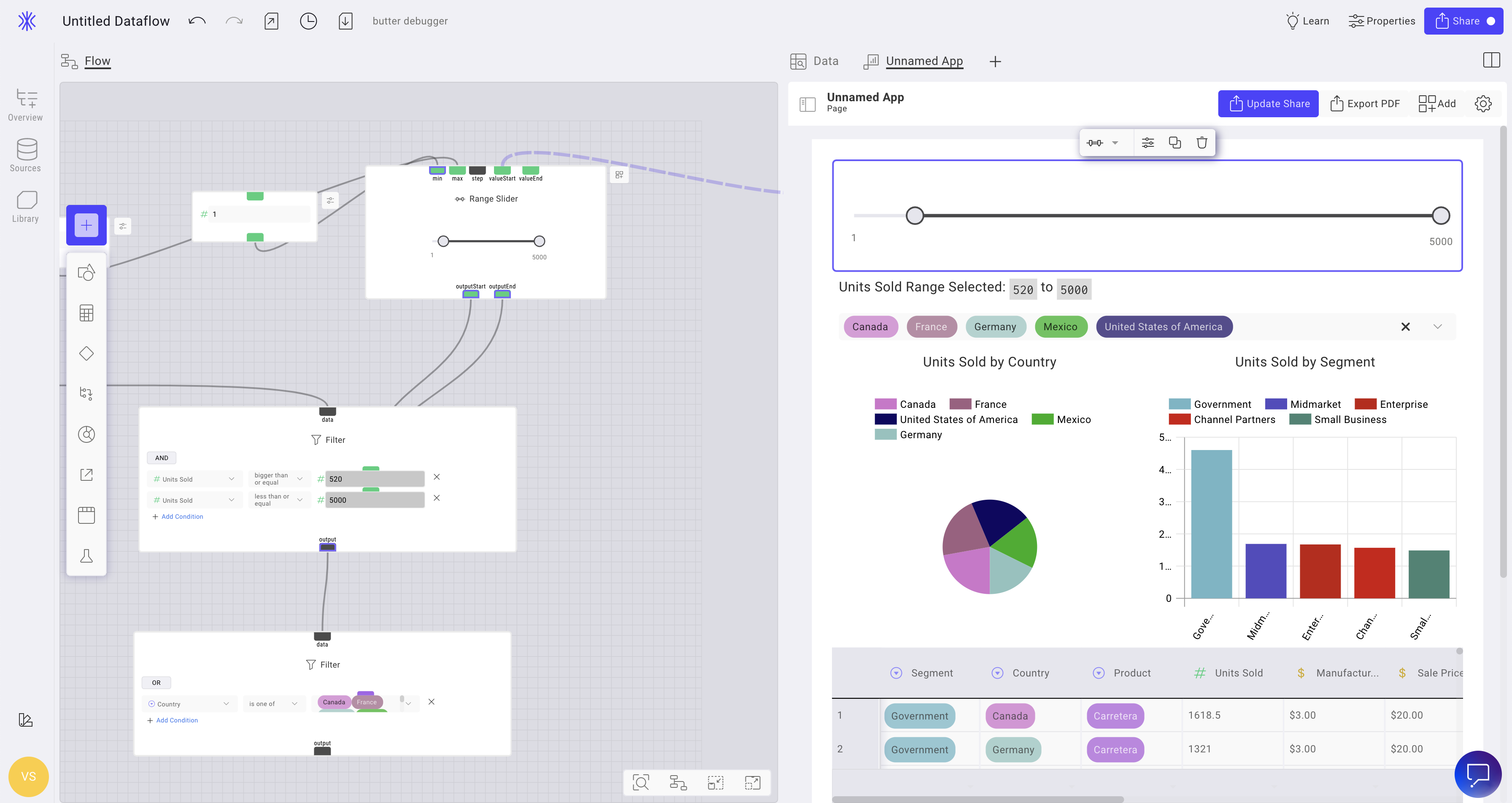
Range Slider
Similar to the Dropdown, the Data App can also control value ranges. These ranges can be connected to Field Overrides to control filter conditions. The user can control the Data Flow using the Data App, and these ranges can be used to control visualizations, like the Dropdown.
Dynamic Text
Dynamic Text allows users to add text that can be populated with data from the flow. This can be used to provide context for the data visualizations and create dynamic reports. Once the data is connected, the text will automatically update as the data changes.
The following example demonstrates how to create dynamic text.
Sharing Data Visualization
Why do sharing security capabilities matter?
It’s essential to have security, governance, and control over how your data visualizations are shared. We’ve added new configuration options when it comes to sharing your dashboards and reports in Toric.
Users now have the ability to share their visualizations securely by:
Adding a password
Create your own secure password to share a visualization. This adds an additional layer of protection, and your end users can still access the and use your report or dasboard.
Setting expiration dates
Determine when or if you want your sharing likes to expire. You can now set no expiration date, or select from a number of options including:
- 24 hours
- 48 hours
- 72 hours
- One week
The shareable link that is available will expire within the timeframe selected by the user.
Sharing a Data Viz

The most common way of reviewing data visualizations is through shared data visualization. These visualizations can be shared internally with people who have a Toric account or externally with anyone.
Visualizations can be shared using a link or embedded into any software that allows embedding, while maintaining all of their features.
Data apps can also be password protected when shared, requiring any user who wants to view the shared version of the app to enter a pre-defined password set up by the app's creator. For more details, please see Securely Share Your Data Visualization Page on Toric.
In the example below, we show how to share the visualization using a link.
In the example below, we demonstrate how to share a visualization internally on Toric.
Customizing your Data Visualization URL
URLs for Data Visualization can be customized to create a user-friendly URL that identifies a specific Shared App. The "shareable link" tab in the sharing settings provides a suggested URL, which can be modified. Follow the step-by-step instructions below and watch the video to learn how to customize your URL.
- Click on the “Share” button located in the right corner of your screen.
- Locate the "Allow Access Link" and click on “Edit”.
- Make the desired changes.
- Click on “Set”.
Note: Changing the URL to the visualization will make the old link inaccessible.
Exporting to PDF
Data visualization can also be exported as a static PDF.
In the example below, we demonstrate how to export a data visualization to PDF.


